Our brand guidelines serve as comprehensive instruction set designed to ensure consistency and coherence across all visual and communicative aspects of our brand.
The company
Our product
The language, a variant of general APL
Each primary colour is defined as a ten-step scale rather than a single hex. Steps run 10 (lightest) to 100 (darkest), so a tint or shade is always one lookup away instead of a fresh design decision. Click any step to copy its hex.
Each colour’s true, unmodified hex sits at whatever step matches how light or dark it actually is, not always step 50. Retina Searing Orange and Retina Soothing Lavender are naturally mid-brightness, so their real colour lands at step 50. Gunmetal and Midnight are dark colours to start with, landing at 80 and 90. Every step lighter than that blends toward white, every step darker blends toward near-black.

Lotion and Raisin aren’t part of a ten-step scale, they are the fixed floor and ceiling everything else is measured against.
Deliberately separate from the brand palette, so a status message can never be mistaken for a brand accent.
Where possible, the logo appears in Retina Searing Orange (#FF6A13). Where that isn’t possible, use white. If contrast is still too low, use Raisin first, then black. No other colours are permitted, and this list is exhaustive, not a starting point.
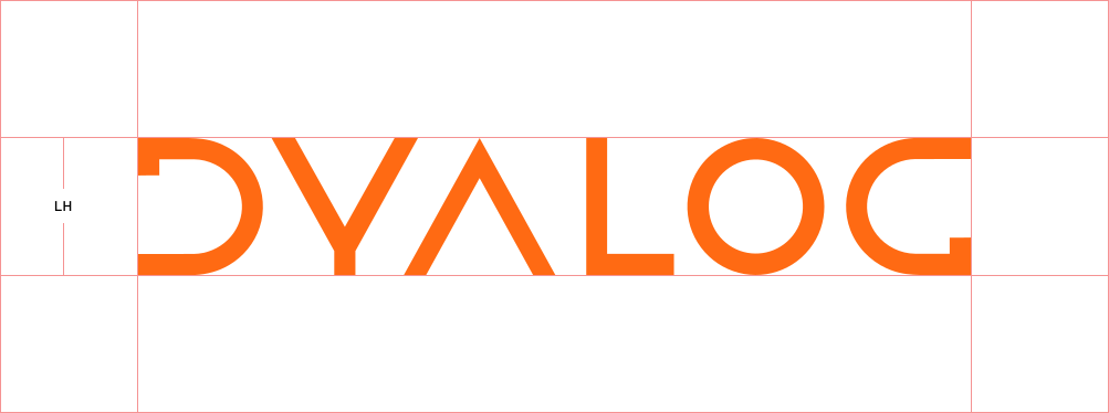
What’s the difference between clearspace and margins? In design and typography, ‘clearspace’ refers to the area surrounding a design element, such as a logo, that must remain free of other visual elements to ensure clarity and visual impact. ‘Margins’ are the spaces between the content and the edges of a page or container, creating a buffer zone that enhances readability and prevents text or images from being cut off.
Clearspace: When using our company logo in a design, ensure it has sufficient clearspace and margins for optimal visibility. The logo’s clearspace is defined by the distance from the logo to any surrounding elements, using the logo height (LH) as a reference. For example, if the logo is 30px tall (LH = 30px), there should be at least 30px of clearspace around it on all sides to maintain its visual integrity and impact.
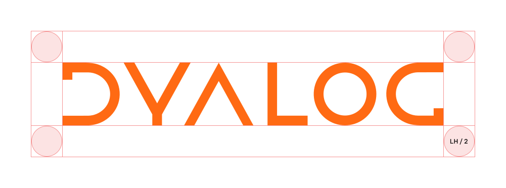
Margins: The logo’s margins are the space between the logo and the edge of the composition. When placing the logo, use half the Logo Height (LH/2) as the distance to the margin. This is the minimum allowed margin to ensure clarity, but the space can be increased if necessary.
For example, if the logo is 30px tall, the distance between the top and left sides of the logo and the edges of the composition should be no less than 15px.
We aim to maintain consistency throughout our branding, and our company logo should only be used as described above. Here are some examples that are not permitted!
If you plan to use any of our branding, please download our Media Kit. It includes various versions of our logo (in SVG and PNG formats) as well as our colour palette (in PDF format).